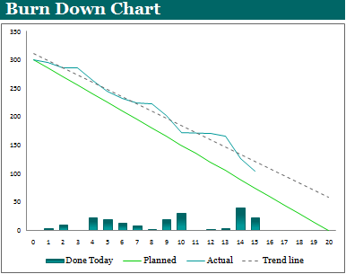
A burn down chart provides a graphical representation of the work left to perform plotted against time. They are most commonly used during Agile software development to burn down the work remaining in the current sprint. If you’re involved in Agile project management you’ve probably seen these before, if not, read on and we will take you through it so that you have all the knowledge and understanding you need to work in this way. Below is an example of a burn down chart:
What this example is showing is that we have 300 story points to complete in 20 days (4 working weeks). The “Planned” line shows the plan we are aiming to follow at the beginning to the sprint. The “Actual” line shows how we’re progressing against this plan. The “Actual” line is interpreted as follows:
- If the “Actual” line is above the “Planned” line then we are behind schedule. Essentially, there is more work than predicted, resulting in us being behind schedule.
- If the “Actual” line is below the “Planned” line then we are ahead of schedule. Essentially, there is less work than predicted, resulting in us being ahead of schedule.
The “Trend Line” will help you better understand your burn down data by averaging out the “Actual” line data. From the diagram above we can see that this particular piece of work is running about 20-25% behind schedule. The “Done Today” bars simply show how many story points were completed each day.
You can see that this piece of work has 5 days to finish, and as we’re trending approximately 25% behind schedule, it is going to take an Herculean effort to finish all the work in time. Ultimately, a burn down chart provides a great method of instantly seeing the status of a piece of work.
Although burn down charts are most commonly associated with Agile software development, where you use them is only limited by your imagination. For example, I have used them for:
- Risk Management: to visualize how total risk is trending during a project.
- Issue Management: to visualize how total issues are trending.
- Bug Management: to visualize how end-to-end defects are trending at a program level.
For project managers burn down templates can be invaluable. If you found yourself managing a project made up of multiple sprints and in the first 2-3 sprints the team(s) were consistently 20% behind the planned output the recommendation would be to inform your steering group that the project is likely to be late or something will need to be dropped from scope.
I’ve uploaded a Burn Down Chart Template for you to download and use in your projects and programs. The template is an Excel file. Enjoy.
